✏️ Really fascinating photography & font article, by Arun Venkatesan, on the typeface created for Leica, over on his gorgeous website: Arun.is
I LOVE the design of his website!
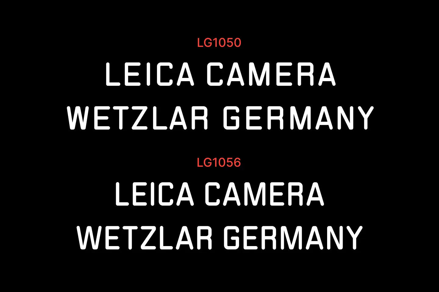
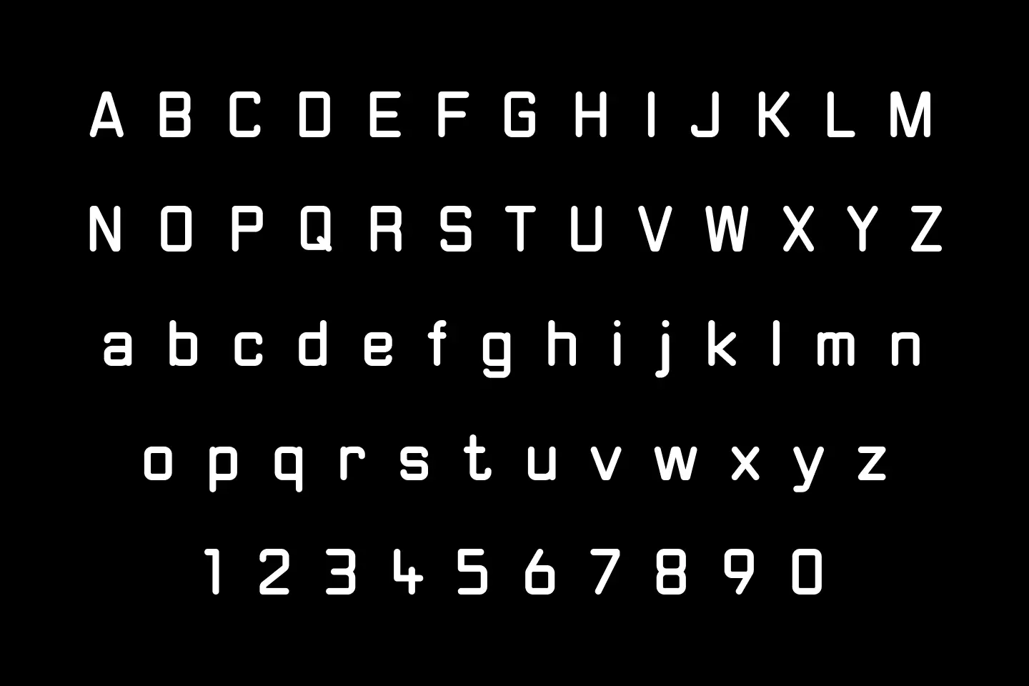
Leica used the DIN font for labeling cameras and lenses for many decades. At some point, I think it must have been around 1987, Leica decided to develop a different font due to its better millability, which was easier to use on the products (at that time the milling machines could not yet do free forms etc…).
The engineers there developed the LG1050 and this was used for engravings. It only has straight lines and quarter circles and only one line thickness. The characters end in curves. This makes it possible to mill them in one line without the milling cutter having to go over the same spot multiple times.