
Introducing Kermit: A typeface for kids
Using design to empower children by making reading easier, improving comprehension, and helping dyslexics.
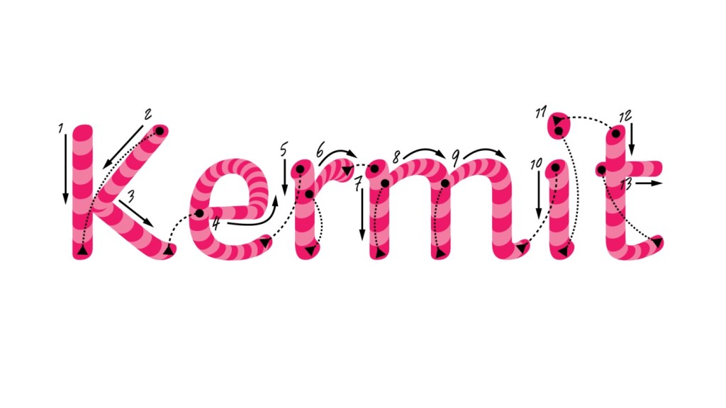
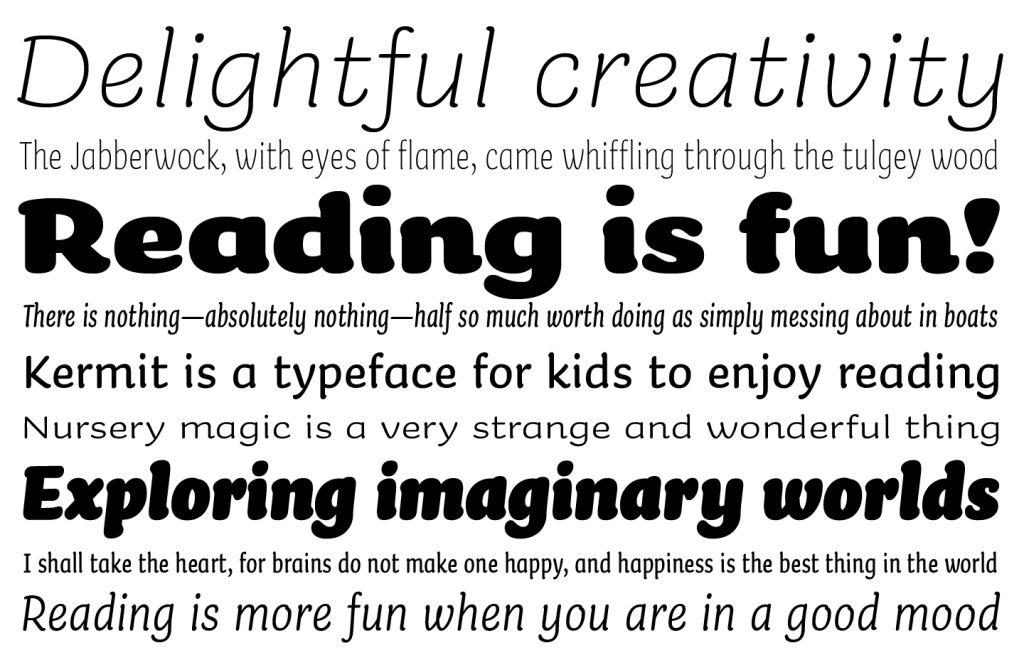
Kermit was designed for children to easily read, making legibility a priority. Underware imbued Kermit with a large x-height, thick strokes, generous spacing, and familiar letter shapes, striking a perfect balance between the informality of handwriting fonts and the structure and readability of classic book typefaces like Garamond or Avenir.
⇲ Source: microsoft.design/
